Sunglasses Draw Attention to Mobile-Friendly Content
This started off as a mobile marketing post, but before you knew it, as I was working it out in my head, it veered into a content marketing post. And it actually all started with an email. Maybe even the story of this post speaks to current nature of marketing, and if you are doing it right, then you just can't unbundle all the parts from each other like we hope to do one day with our cable tv packages.
Like I said, it all started with an email. I am a huge fan of Warby Parker, the company that makes and sells eyewear at affordable prices, especially to millennials. I have two pairs of their glasses. The brand has a very distinctive style that uses simple line drawings to convey their sense of style. It is familiar and very relatable. While their website primarily shows their products, it is lightly adorned with these illustrations.
Yesterday I received an email from Warby Parker and I read it on my phone. The subject line was "Never Take Them Off," and the title within the email was "Eight Ways to Wear Sunglasses Indoors."
The weather is warming up as we are heading into Spring, with Summer just around the corner. It's a good time to start thinking about sunglasses, but Warby Parker subverts that natural instinct to think about the outdoors and talks about sunglasses inside.
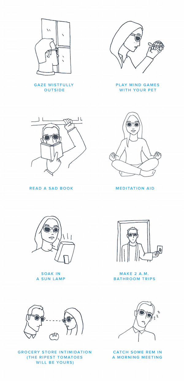
Before we get into the mobile aspects of this, let's talk about the content. This is a simple list post, but with attitude. Each of the eight entries features a simple line drawings and a title. There's no fluffy copy to fill this out. Just the image and the title, which combine for a laugh. Who really has a pet turtle anymore? You could call this visual content if you want, but I would call it simple content. The illustrations might be a challenge for some companies, but not for Warby Parker, since this is part of their brand.
This is perfect content for an email that is most likely read on a mobile device. They know their audience. Even though you see the image below as two columns, the email rendered on my phone in one column. It is easy to read, easy to scroll, and easy to chuckle. There are shop buttons at the top and bottom of the email, because the point is to get you to browse their collection of sunglasses. This does not feel intrusive, and they need some sort of call to action in the email.
These same eight illustrations also appear on their blog, so they are using this content in multiple places to connect with their customers.
Warby Parker took a simple idea, wearing sunglasses inside, and caught my attention because it was unexpected, humorous, on brand, and very mobile-friendly. It's a good reminder that simple sometimes really is better.
This post originally appeared on the Modern Marketing Blog.